In my day job, I’m a graphic designer. It’s one of those jobs that can be tough to explain – people either think I draw pictures or I Photoshop warts off people. Neither of those are true (Okay, occasionally they are true, but not usually.) In my case, I’m about organization and presentation of information.
I don’t consider myself an artist – I’ve got enough skills to fake it, but I know some real artists. Their skills can put mine in the shade. However, because of the organization/presentation skills, I manage to keep steady paychecks coming in.
One of my favorite things to design and see designed is movie posters. I love the vivid imagery of movies, and, in the right hands, they lend themselves to great posters.
Which brings me to something that is not a great poster.
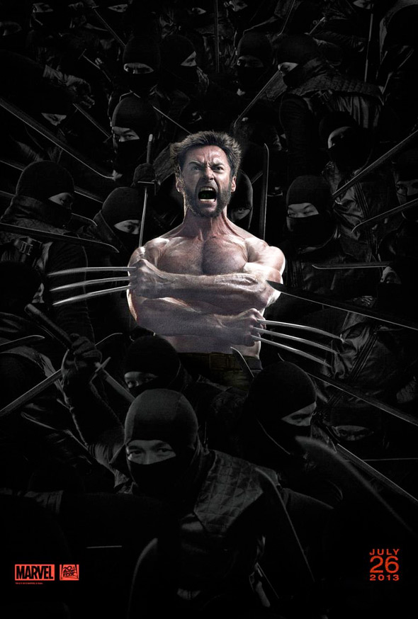
Now, I’m admittedly biased. I’m a fan of Wolverine – I like Hugh Jackman as the character, and I generally like him in the comic books. X1 and X2 were solid movies, and let's just consign X3 and Origins to the "that didn't really happen" bin, okay?
That said. This pop-up Wolverine-in-the-box is ridiculous. The lighting is terrible. The interaction between the two forces is nonexistent. Why are the ninjas dark and Wolverine has two spotlights on him? The claws relationship to the knuckles is different on each hand. The head is obviously cloned from the same shoot as the international poster (and as others pointed out - why is Wolverine in front of the Dark Knight poster?) – it may be the same image. Some of the ninjas are cloned. I could go on, but I'd rather impale myself on those claws.
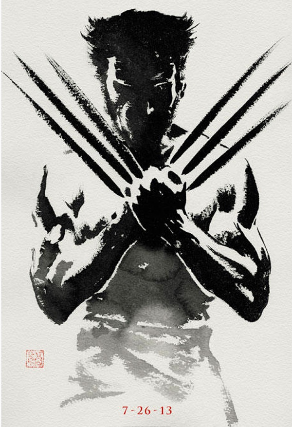
It’s a depressing start to summer movie season. I’m hoping the movie reflects the kickass teaser poster more than this badly Microsoft Paint-ed drivel.